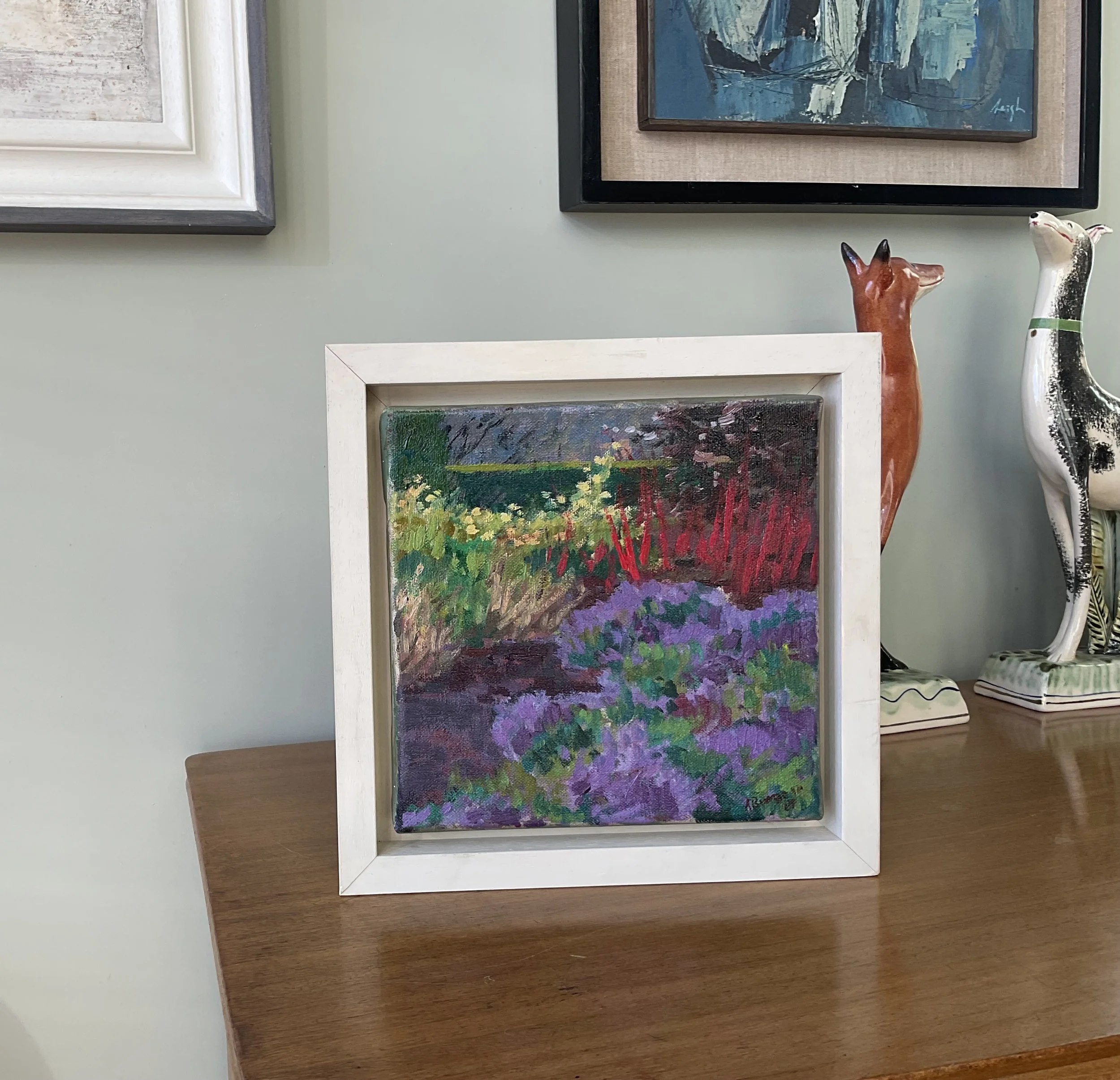
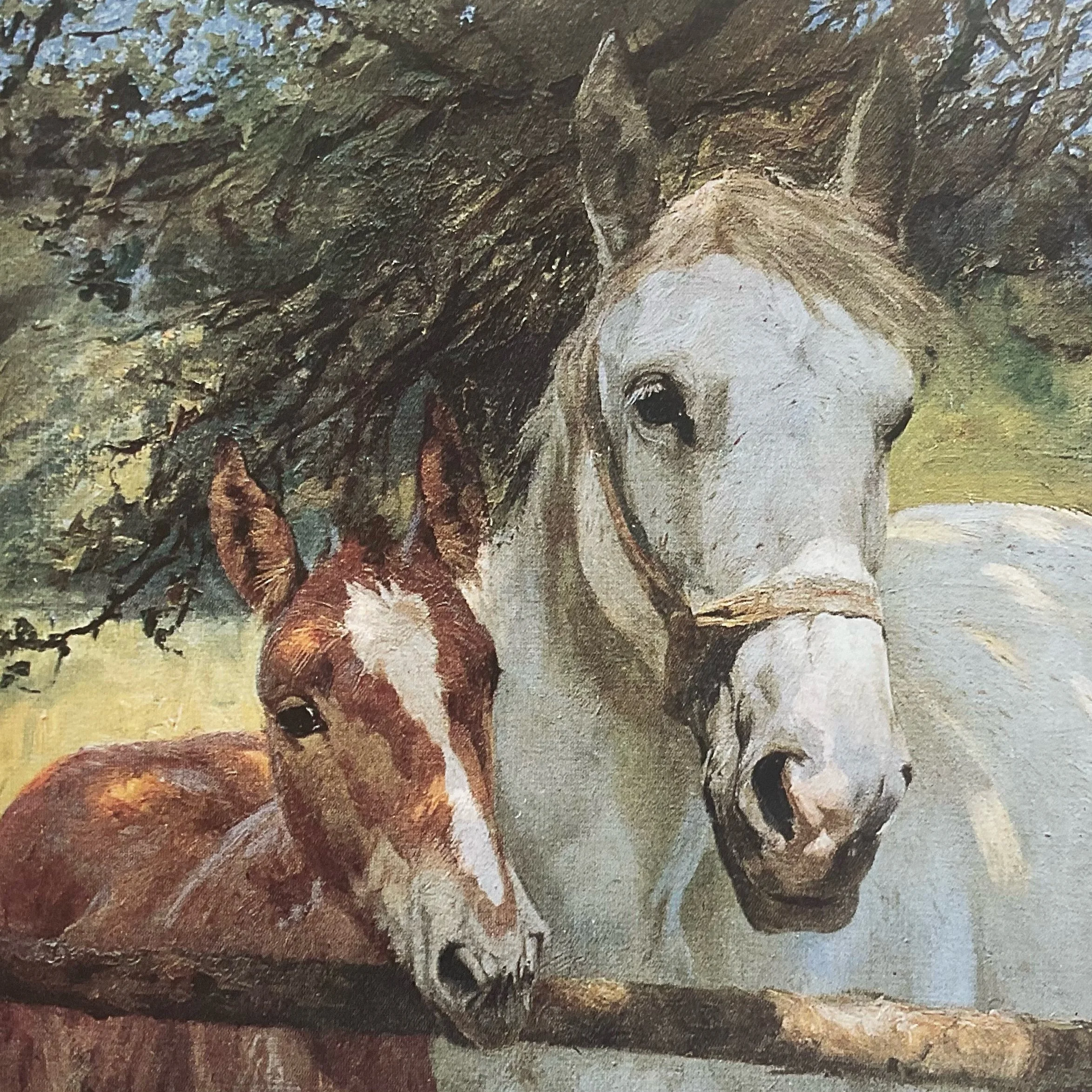
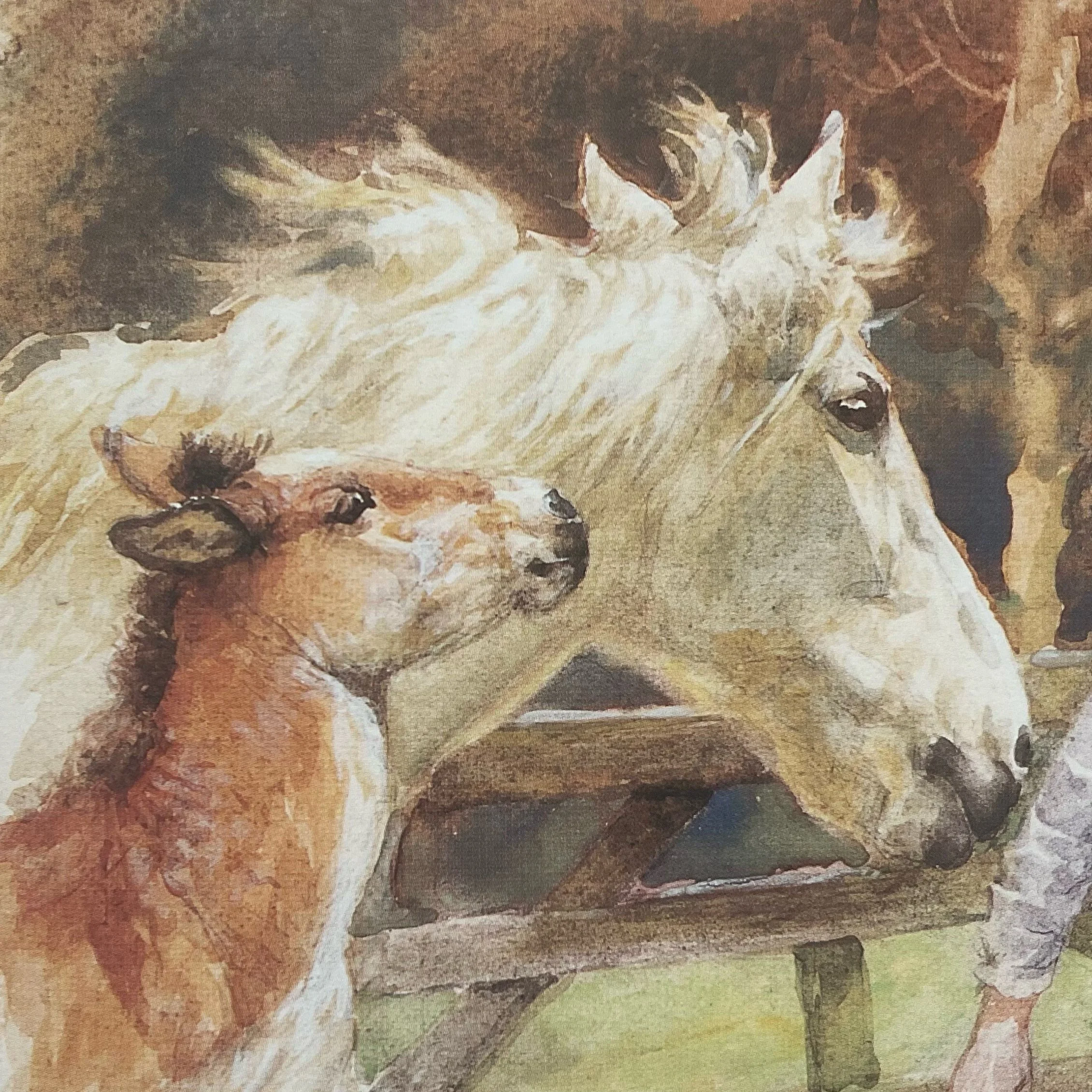
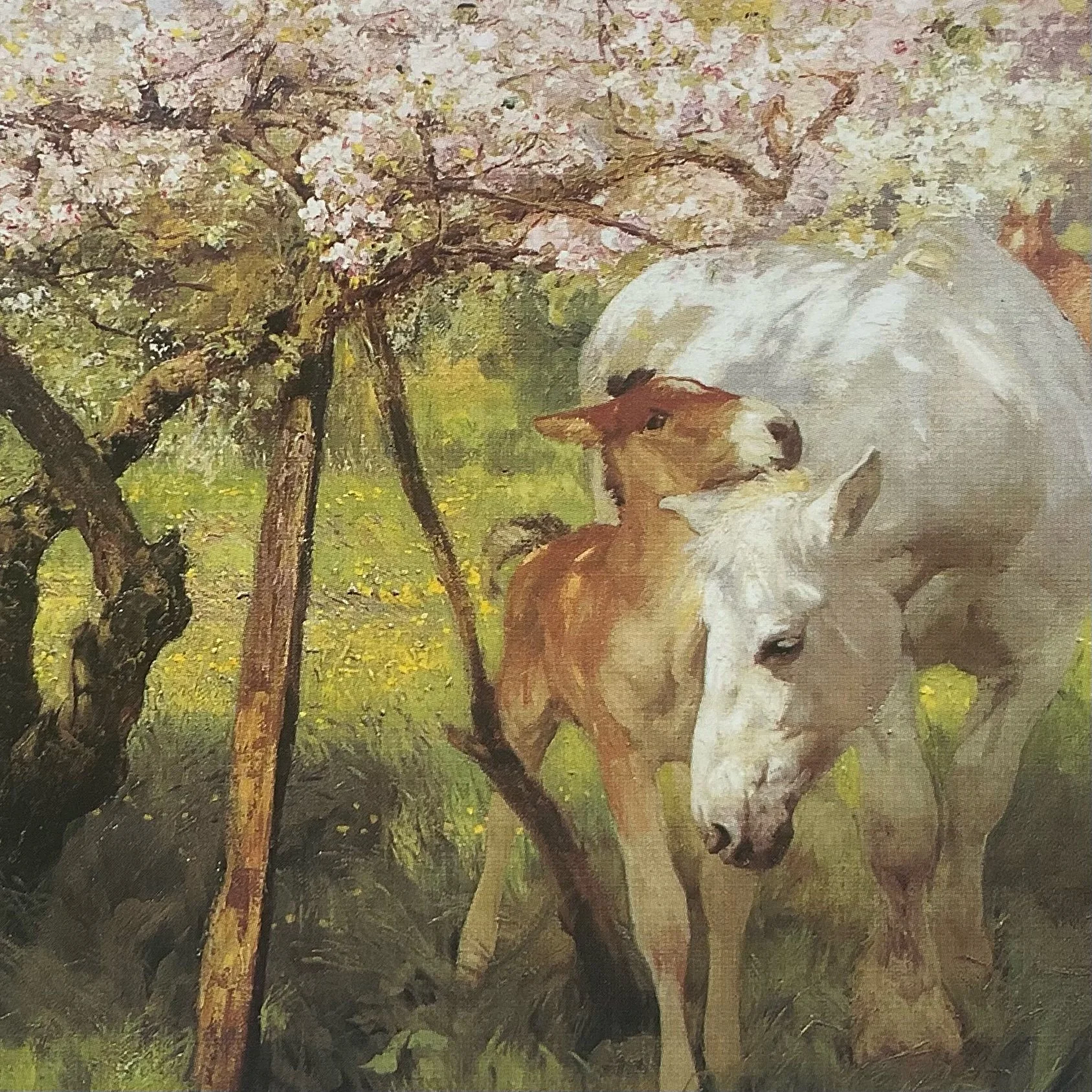
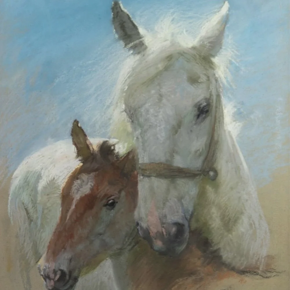
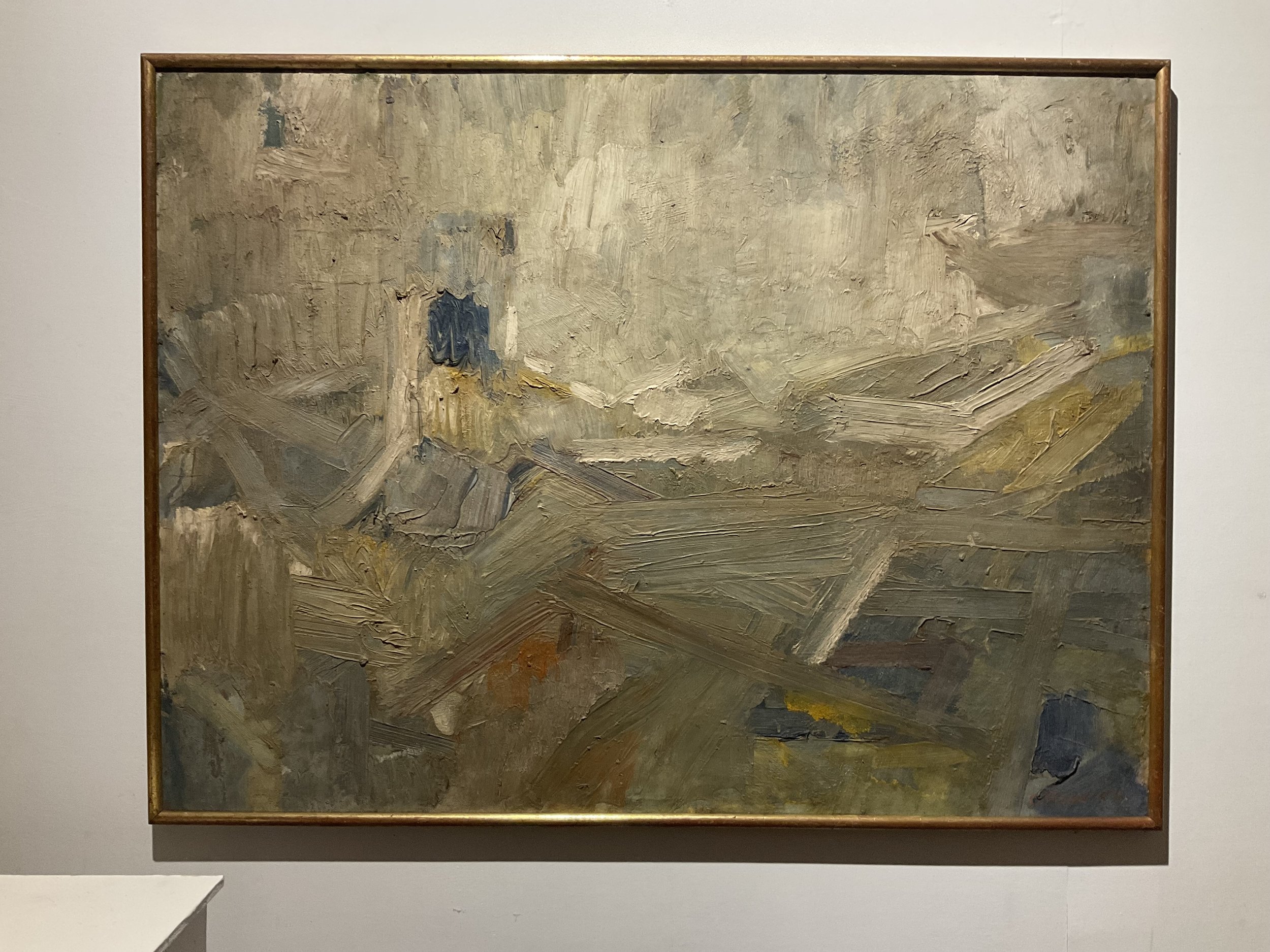
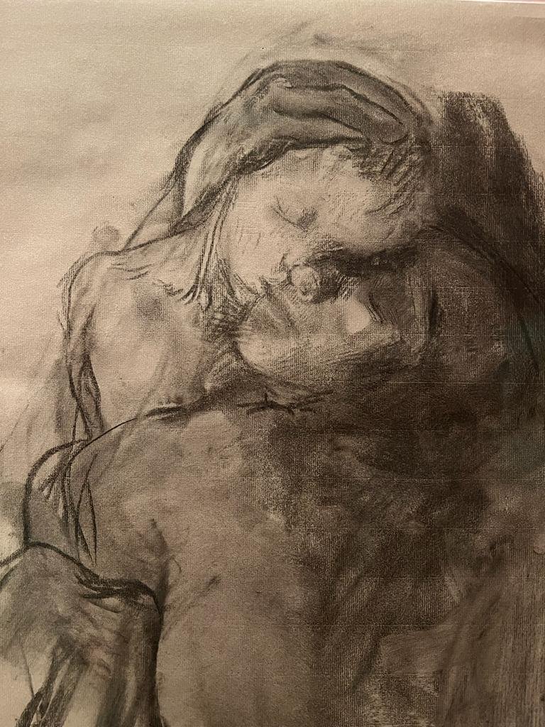
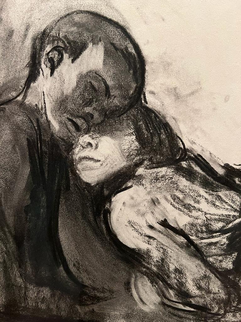
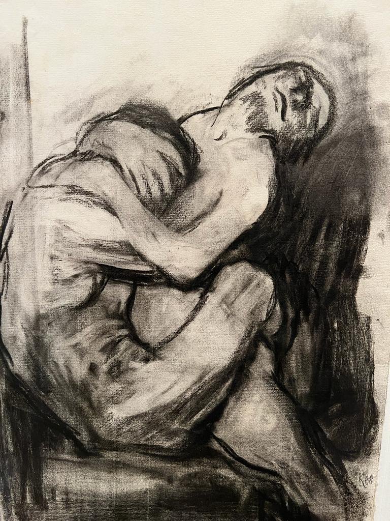
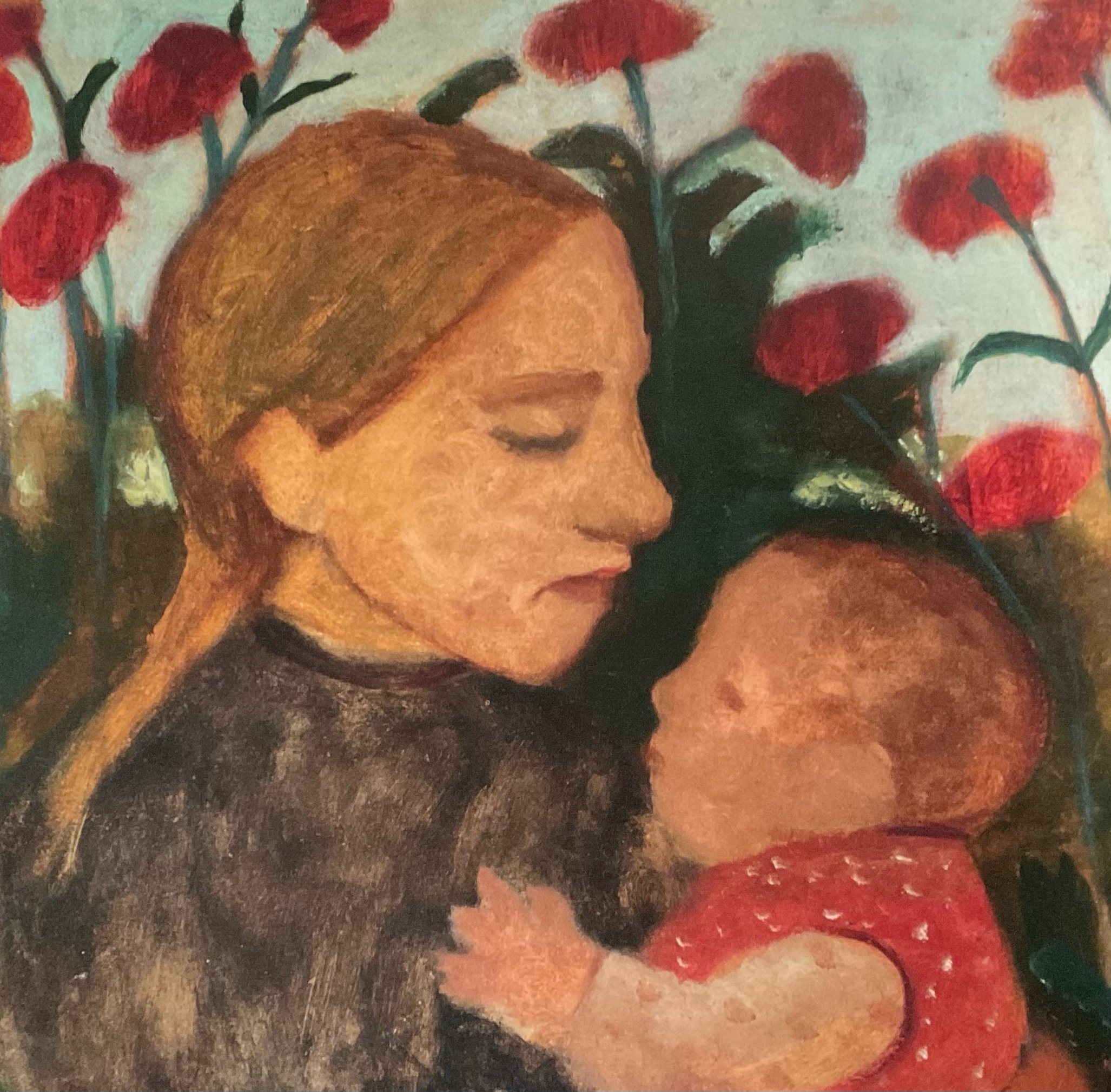
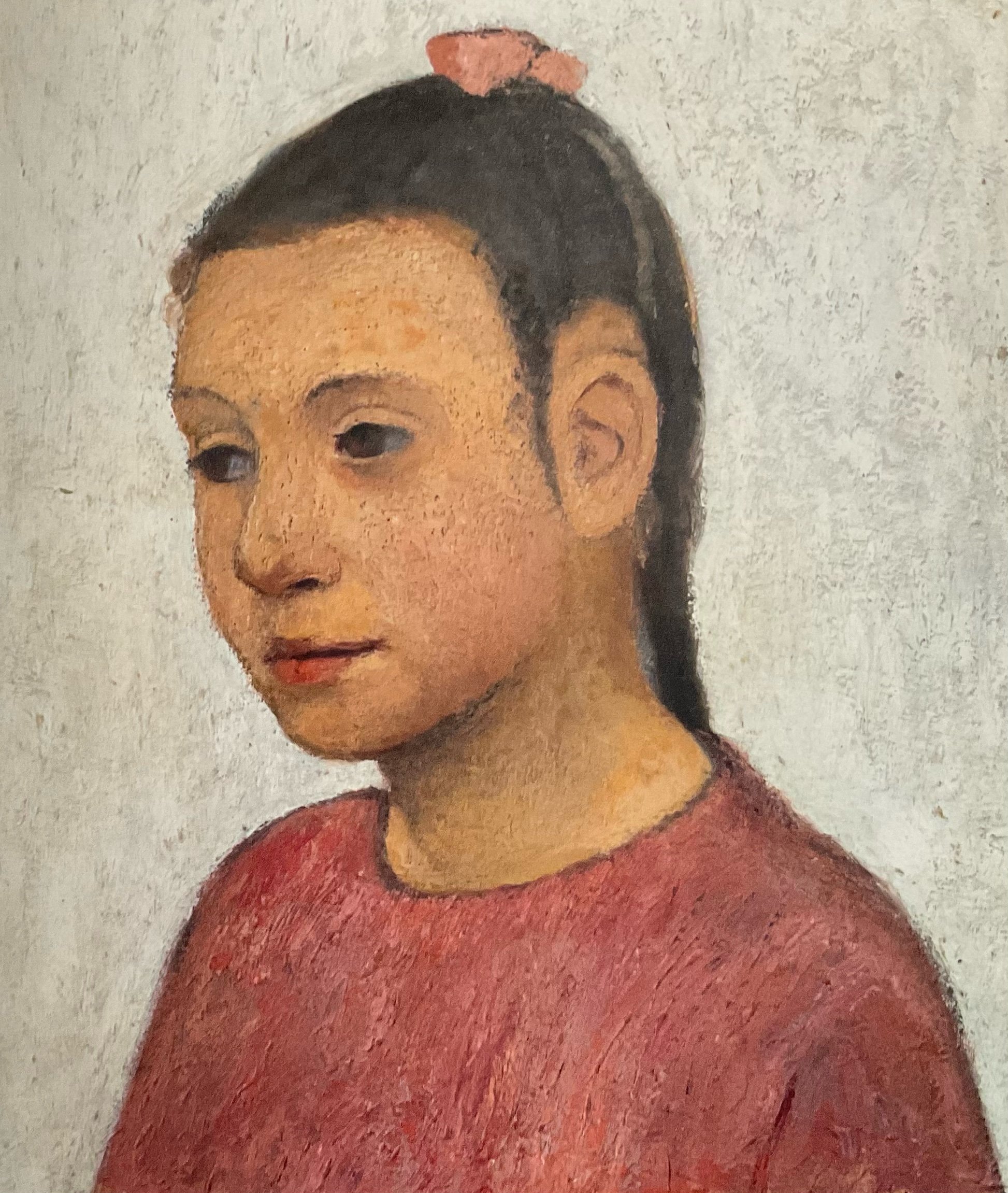
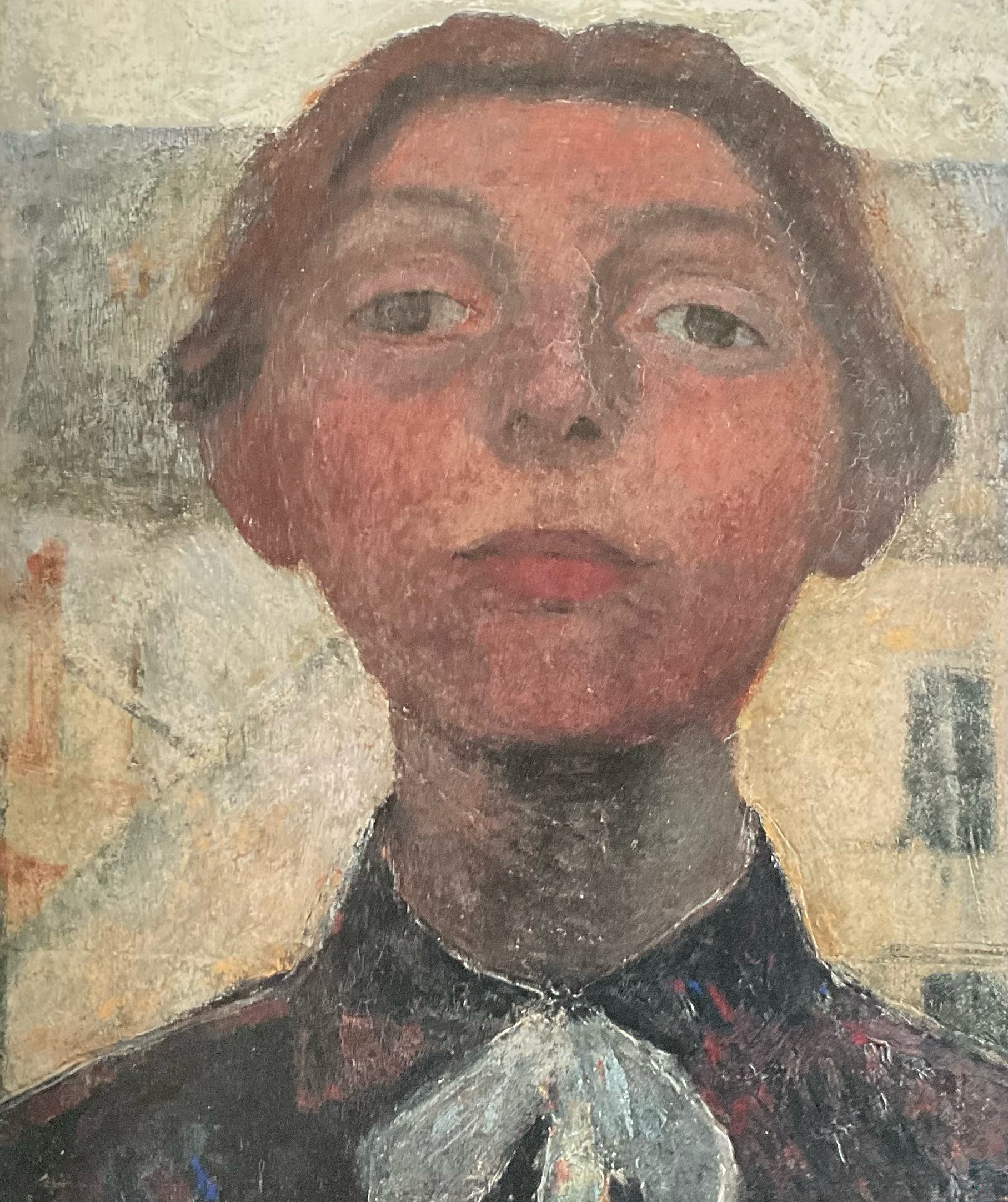
Summer 2026 exhibition including work by Alan Burgess
Who Are Blondes Fine Art?
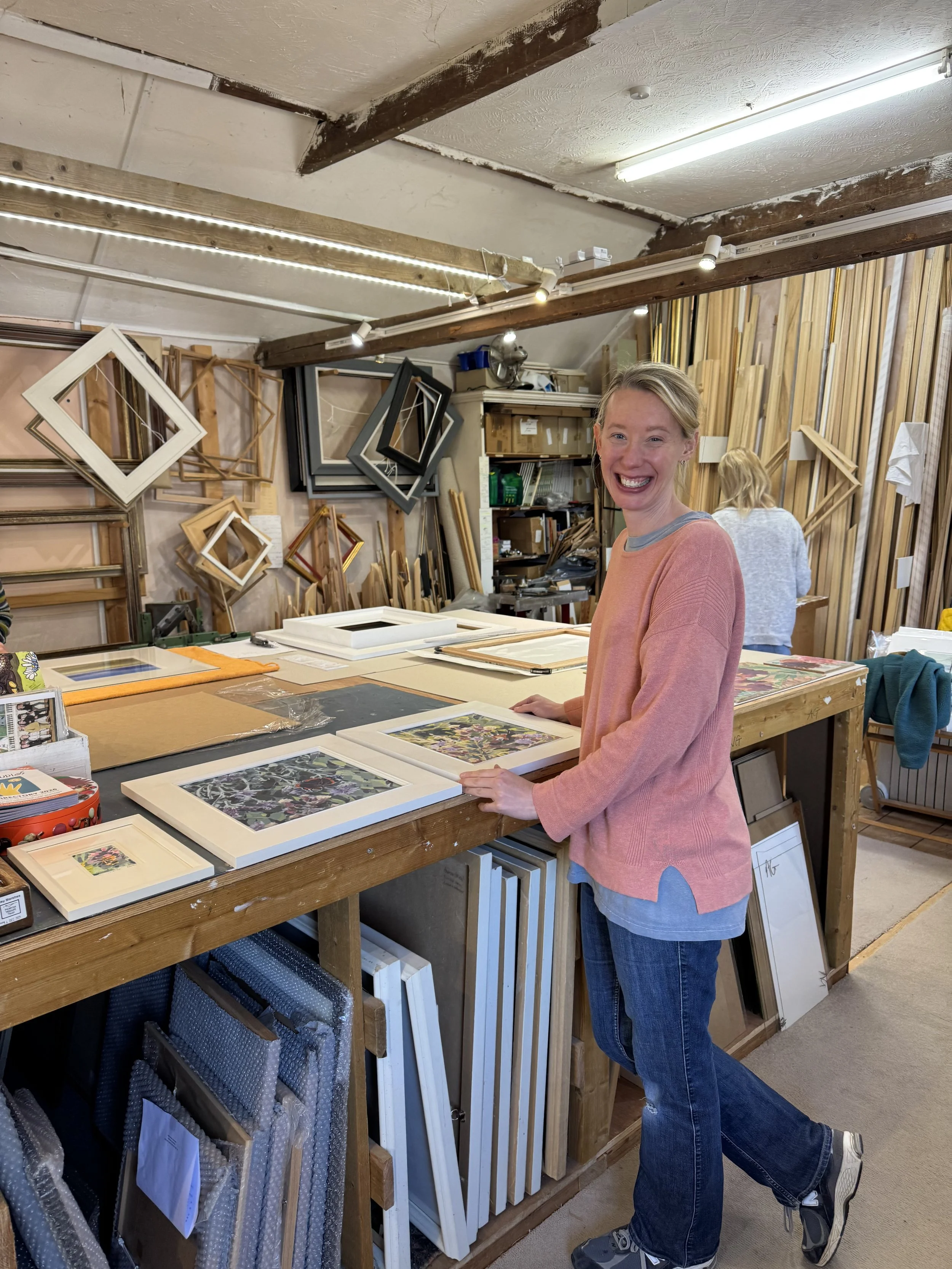
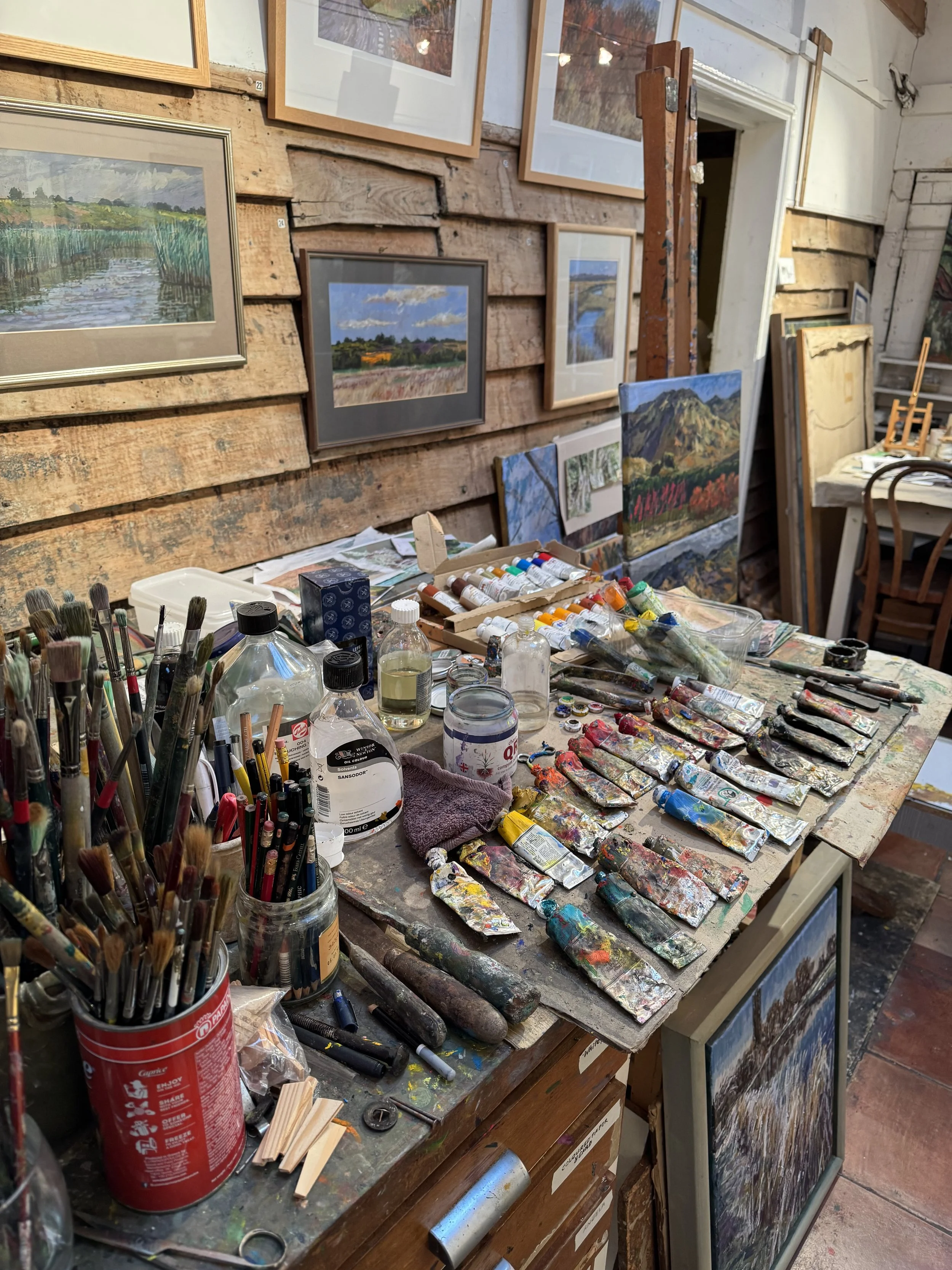
Blondes Fine Art was established by husband and wife team Mel and Mark Ponting more than fifteen years ago. We are proud to support collectors, families, executors and art enthusiasts buy and sell quality British paintings and prints. From our base on the Hertfordshire/Essex borders just North of London, we have built a reputation as one of the UK's trusted online specialists in Modern British and Contemporary art, working with collectors throughout Britain and internationally.
Whether you are looking to purchase a painting by a favourite artist, sell an inherited collection or simply learn more about the value of a work of art, Blondes Fine Art offers a personal and knowledgeable service based on experience, expertise and a genuine passion for British art.
A Specialist in Modern British and Contemporary Art
At Blondes Fine Art, we specialise in:
Modern British paintings
Contemporary British art
St Ives School artists
Scottish and Welsh art
Prints and works on paper
Post-war British abstraction
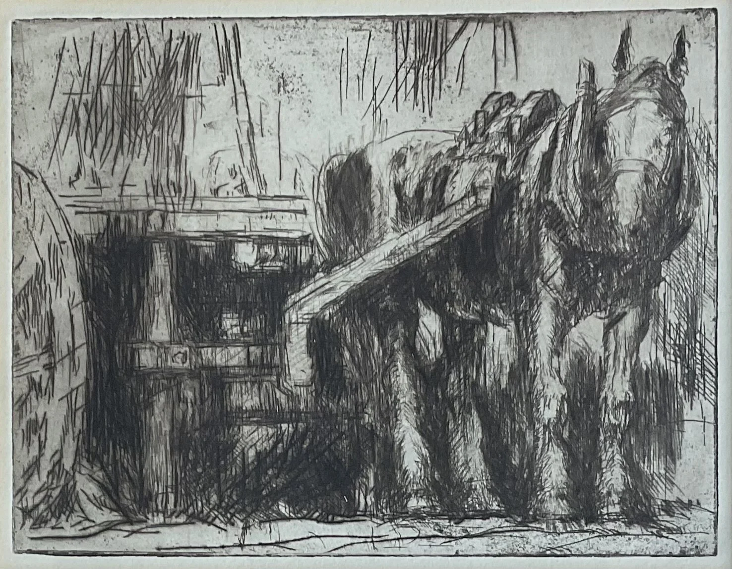
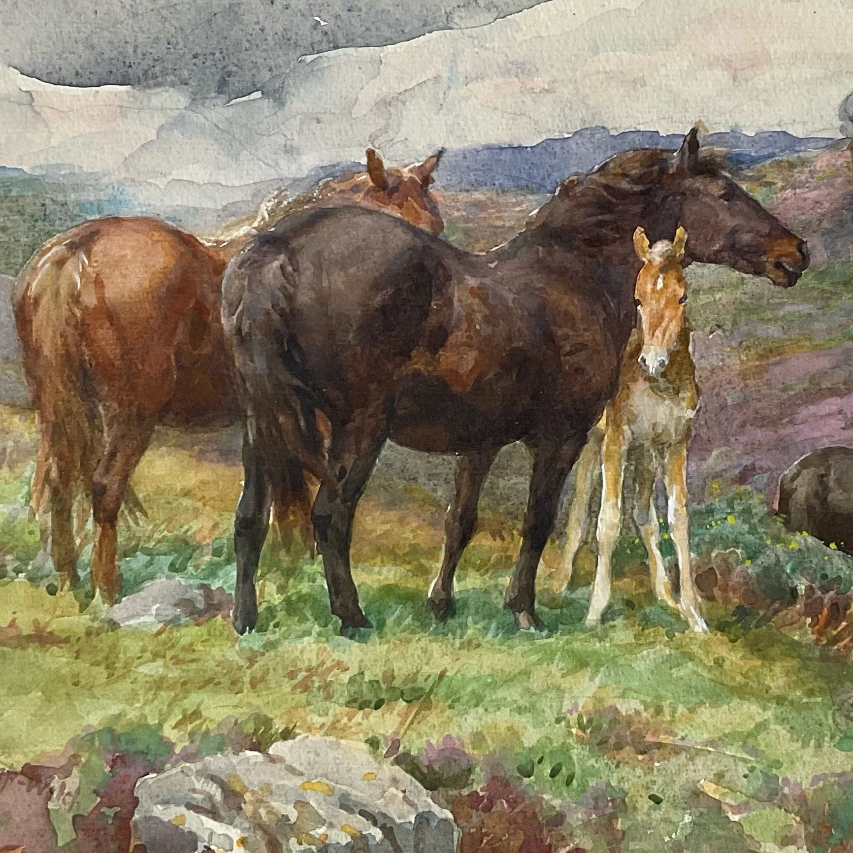
Sporting and equestrian art
Over the years we have handled works by many important artists, including:
Patrick Heron
Terry Frost
Mary Fedden
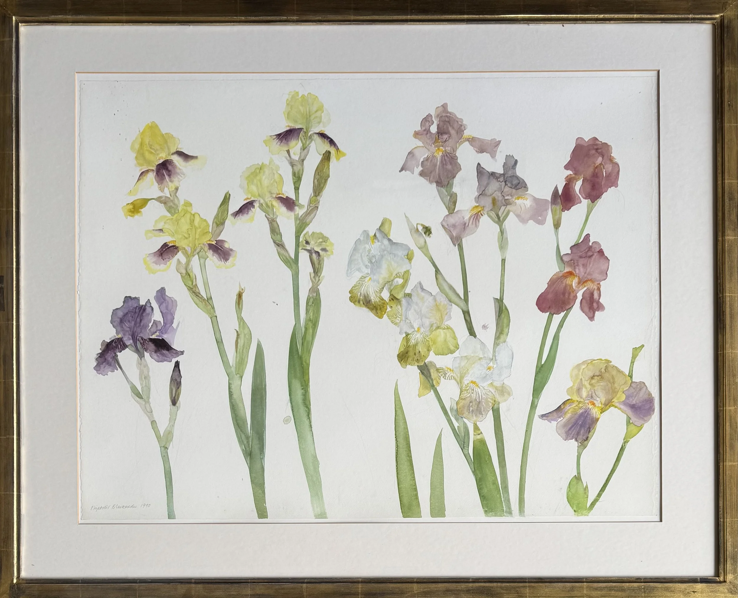
Elizabeth Blackadder
Julian Trevelyan
John Bellany
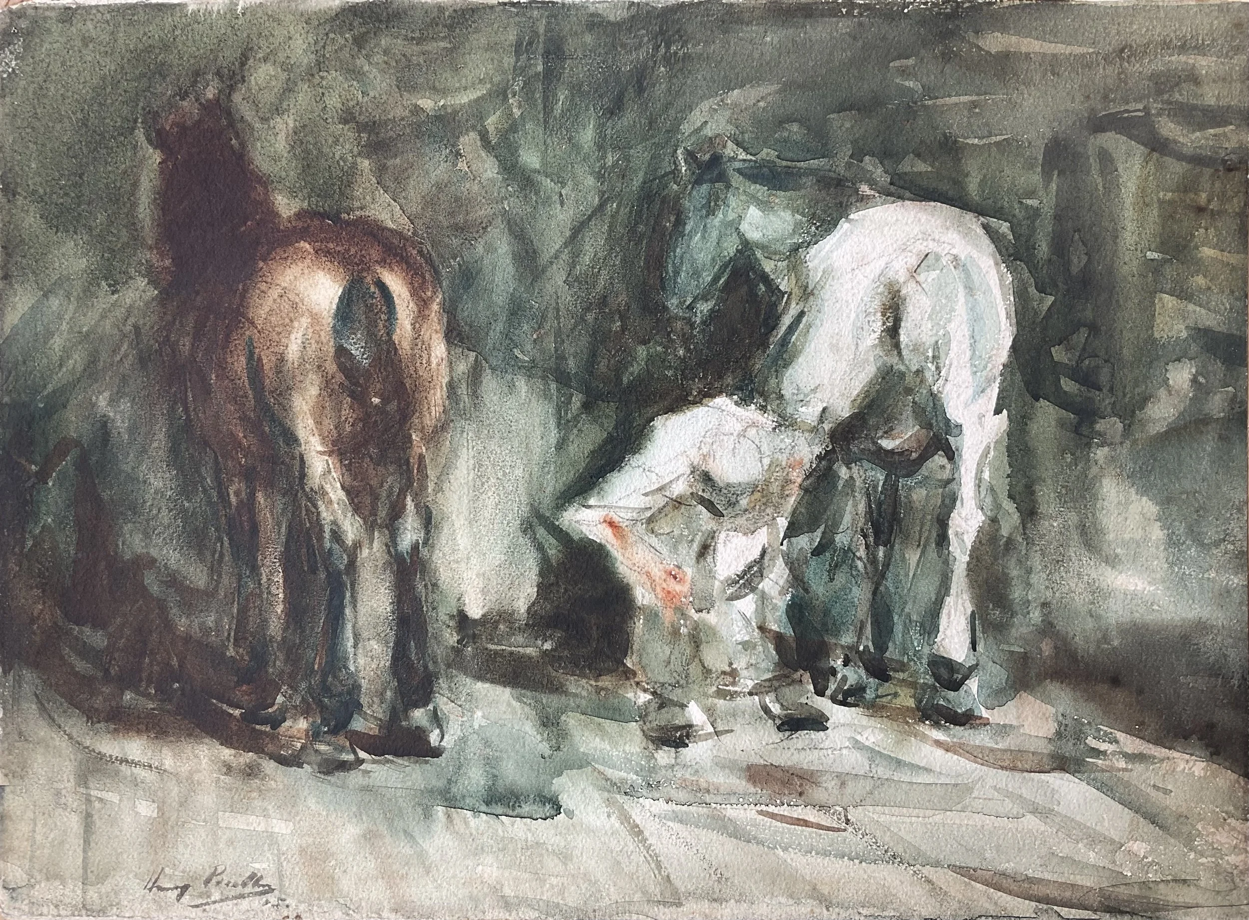
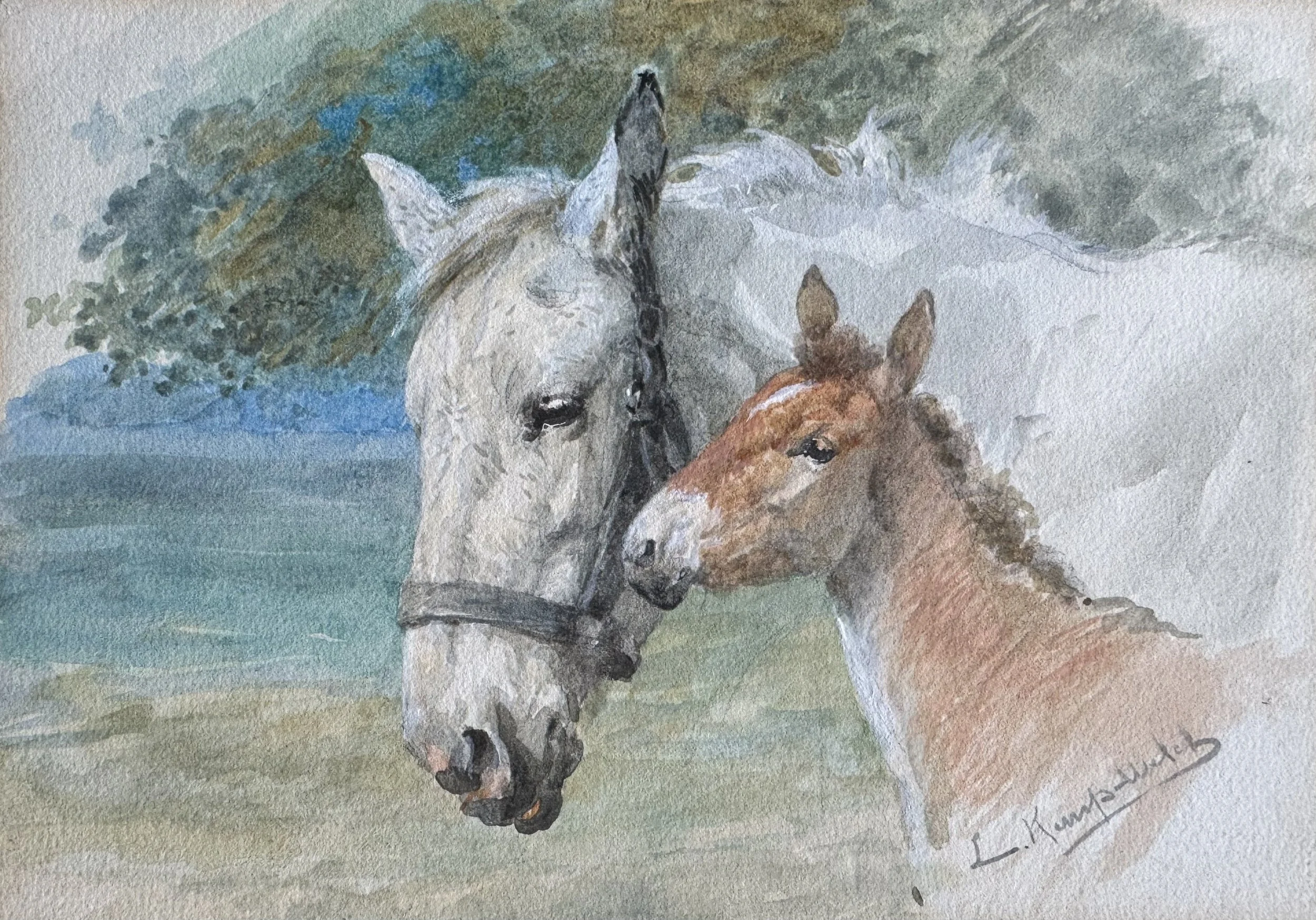
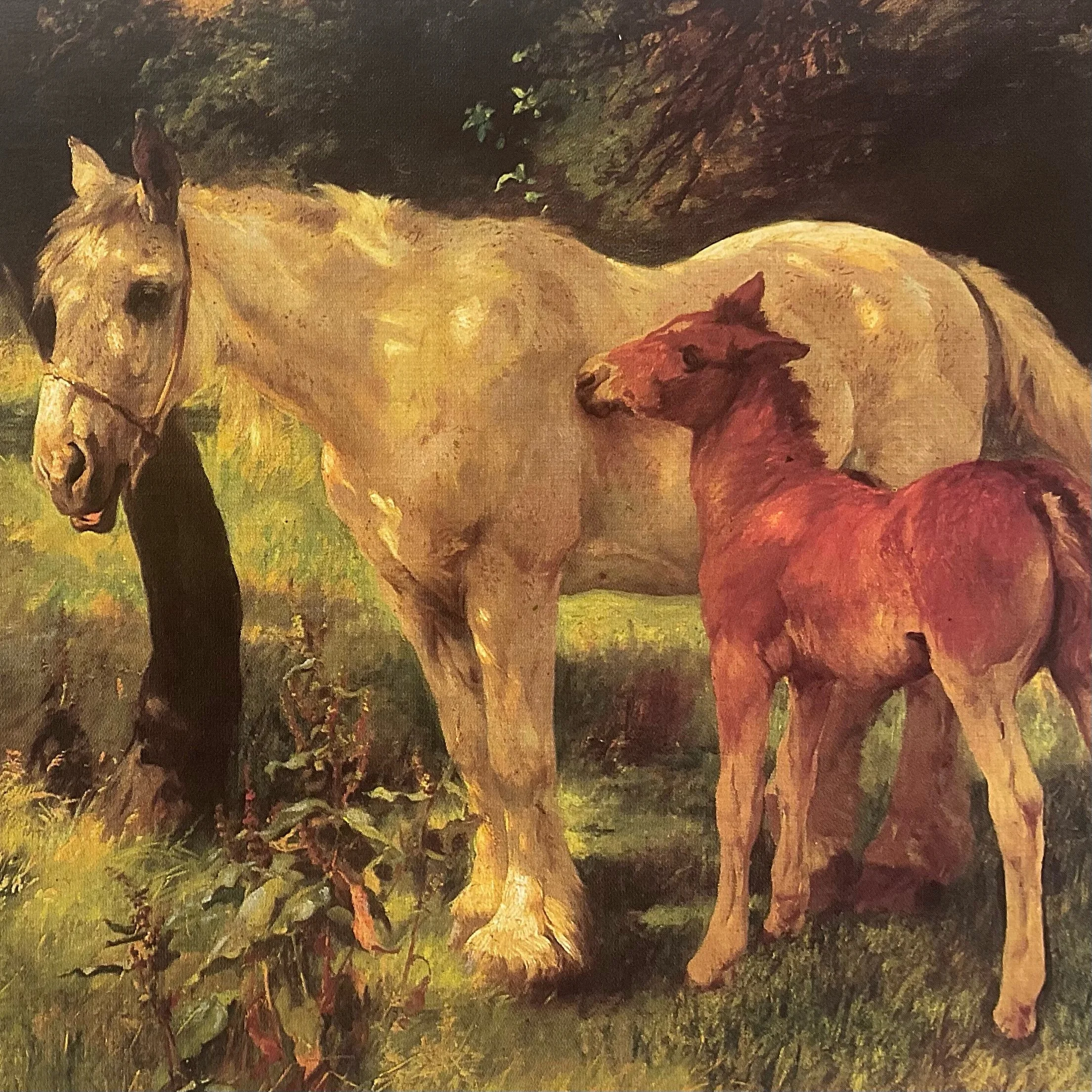
Lucy Kemp-Welch
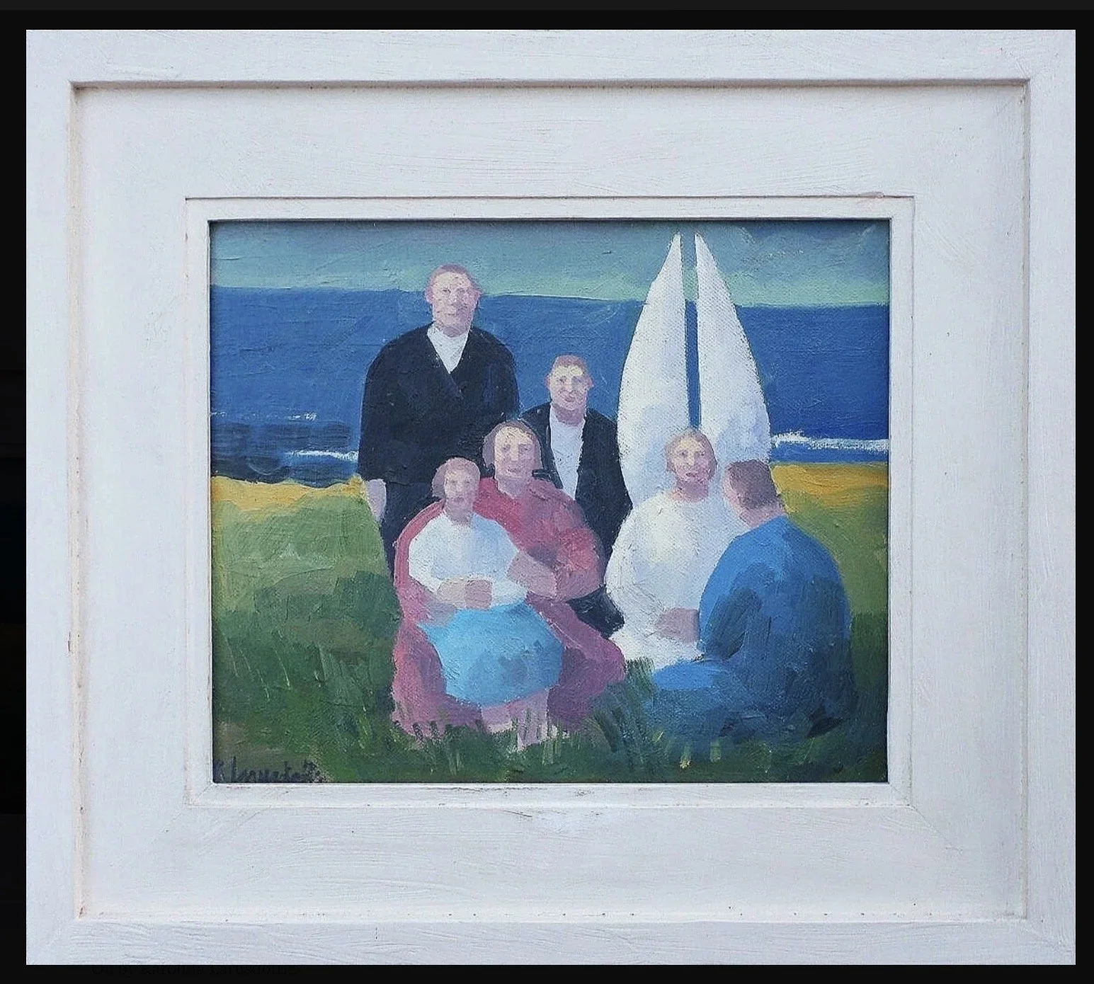
Karólína Lárusdóttir
Eileen Cooper RA
Fred Cuming RA
Our aim has always been simple: to connect exceptional works of art with collectors who will appreciate and enjoy them.
Over Twelve Years of Online Art Dealing
Blondes Fine Art was established with the belief that buying and selling art should be transparent and enjoyable.
Long before online art sales became commonplace, we embraced the internet as a way of reaching collectors throughout the UK and overseas.
Today, our website and online platforms allow us to work with:
Private collectors
Interior designers
Solicitors and executors
Estate managers
Museums and institutions
Families dealing with inherited collections
Many of our clients return to us time and again because they value our personal approach and specialist knowledge.
Buying Paintings from Collectors
One of the areas in which Blondes Fine Art has developed a strong reputation is purchasing works directly from private owners.
We are always interested in acquiring quality paintings and prints by British artists.
We regularly buy:
Single paintings
Entire collections
Inherited works of art
Estate collections
Probate property contents
Artist estates
Unlike many auction houses, we can often make immediate offers and provide a quick and discreet service.
Selling Art Through Blondes Fine Art
If you own a painting and are considering selling, we are happy to provide confidential advice.
Our services include:
Free initial valuations
Probate valuations
Immediate purchase options
Private treaty sales
Advice on current market conditions
We understand that selling artwork can often involve difficult family circumstances, inheritance matters or downsizing, and we aim to help you by providing a companionate, supportive and professional service.
Why Collectors Choose Blondes Fine Art
Our clients choose Blondes Fine Art because of our:
Specialist Knowledge
We focus on the areas of art we know best, particularly Modern British and Contemporary British painting.
Personal Service
As an independent dealership, we offer direct communication and individual attention to every client.
Nationwide Reach
Although based on the Hertfordshire/Essex borders just north of London we work with collectors throughout the United Kingdom and internationally.
Passion for Art
Above all, we genuinely love the artist and paintings we handle.
Probate and Inheritance Valuations
We regularly assist families, solicitors and executors with probate valuations and estate matters.
Our services include:
Written probate valuations
Collection appraisals
Advice on disposal options
Purchase of inherited collections
We understand that these situations often require sensitivity, efficiency and expert guidance.
Artists We Are Currently Seeking
We are always interested in purchasing works by artists including:
Elizabeth Blackadder
Julian Trevelyan
John Caple
John Christopherson
Harry Becker
Lucy Kemp-Welch
Fred Cuming
Karólína Lárusdóttir
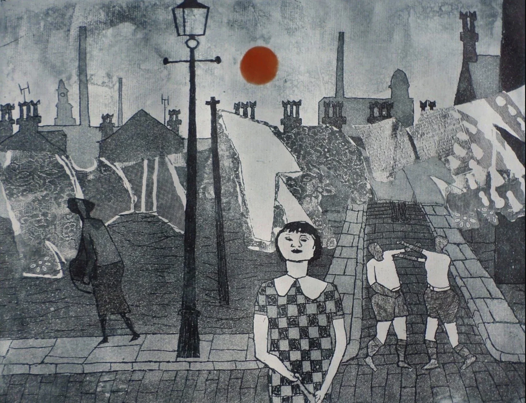
Sheila Robinson
Walter Hoyle
Roy Turner Durrant
As well as many other Modern British and Contemporary artists.
Looking Ahead
The art market continues to evolve, but our approach remains the same: to offer honest advice, specialist knowledge and exceptional service to both buyers and sellers.
After more than a decade in business, we remain passionate about discovering paintings, helping collectors build their collections and finding new homes for works of art that deserve to be appreciated.
Contact Blondes Fine Art
If you would like to buy, sell or value a painting, we would be delighted to hear from you.
Whether you are an experienced collector, have inherited a collection or simply wish to learn more about a painting you own, Blondes Fine Art is here to help.
Call now on 07519639386 and speak to Mel and Mark for a quick and confidential chat.